


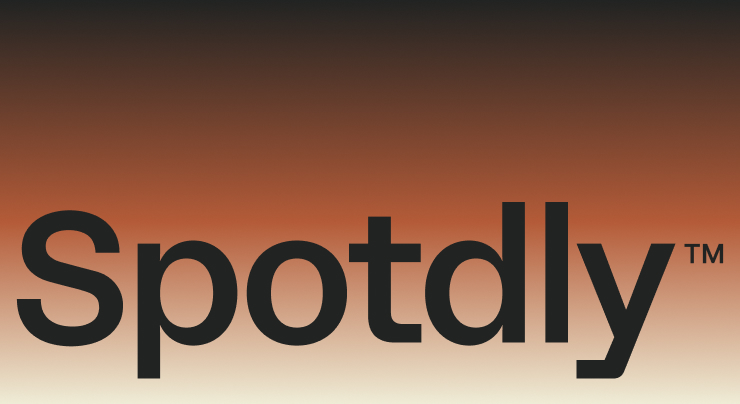
Our new identity brings two qualities of Spotdly into the same frame: the precision of a studio that knows how to build, and the warmth of people who care about what they’re building and who it is for.
As a design and innovation studio with an intentional sense of care, we wanted that relationship to be visible throughout our brand. The result is a system that connects how we look, how we speak, and how people experience the studio.
The people behind the system

For our identity, we worked again with Luis “Threz” Palencia, a Venezuelan graphic designer with a practice rooted in typography and visual expression. His portfolio includes work for Pokémon, Nike, and Hasan Minhaj, among others.
Our previous collaboration gave us a clear understanding of his approach. His typographic sensitivity and graphic judgment matched what this identity needed: precision, character, and a human quality. Choosing the right professional for that brief is part of how Spotdly works. We bring together the expertise each project needs and give it a shared direction.
Together, we translated that direction into the marks, typography, colors, and imagery that define Spotdly’s new visual system.
Precision and warmth, in one mark
The new S brings structure and expression together. Straight lines give it a technical foundation; curves introduce flexibility and a sense of hospitality. Both belong to the same form, reflecting how rigor and care work together at Spotdly.
The wordmark gives the system a clear signature. Its simple typography creates recognition while leaving room for the work to lead. The icon can carry that character into smaller, more personal applications, from a piece of gifting to a detail on a garment.

Character with clarity
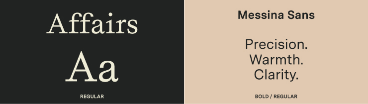
Affairs Regular leads our headlines and larger statements. Its serif forms bring the familiarity of a printed page, while geometric cuts give that editorial character a precise edge. It makes an idea worth pausing over.
Messina supports the reading around it. Regular carries paragraphs and information; Bold provides emphasis and hierarchy. Across navigation, project stories, and supporting copy, it keeps the experience clear and consistent.
Together, the two families let us move between expression and information. A headline can hold attention; the text beneath it can make the idea easy to understand.
A palette built around how we work
Terracotta is our primary color. Grounded in earth and nature, it brings warmth to the identity and expresses the hospitality we bring to our relationships.
Deep Charcoal provides structure. It reflects the expertise, technology, and creative rigor behind our work, giving the warmer elements a confident foundation.
Ivory opens the composition. Its lightness gives images and typography room to breathe, expressing the clarity and calm we want people to feel when working with us.
The gradient connects all three. Precision moves into warmth, then into openness. It gives the palette a continuous expression, carrying the relationship between technical execution and human care across a single surface.

An attentive way of seeing
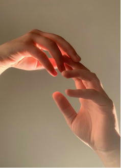
Photography and texture make that care tangible. Natural light, a gesture in the middle of a conversation, or hands at work bring people and process into view. The framing feels close enough to notice something specific.
Textures follow the same approach: bark, water moving over stone, fabric fibers, or light reflected on a surface. Crop, focus, and scale reveal qualities that might otherwise pass unnoticed. These observations give the system atmosphere and a connection to everyday life.

A voice with the same intention
Our language follows four principles: Clear by Design, Polished, Never Stiff, Quietly Ambitious, and Care You Can Feel. They guide us toward precise ideas, natural rhythm, confidence supported by the work, and warmth grounded in understanding.
In practice, that means beginning with what matters, explaining the decision behind it, and showing what it makes possible for someone. We give complex thinking a clear expression and speak to people with the same attention we bring to a project.
A system made to be experienced
A website, a project presentation, a social post, and a personal note each call for a different expression. The system gives them a shared character through type, color, imagery, and voice.
That connection is the purpose of the redesign: making our approach recognizable wherever someone encounters Spotdly. The care behind the work now has a visual and verbal language of its own.


